KAja beauty
Art direction and campaign development for Kaja Beauty’s creative and visual strategy. As one of the first inclusive K-beauty brands sold at Sephora, my team’s role was to build a cohesive and compelling visual brand story from scratch – bringing Korean innovation to life with a fresh, authentic voice.
ROLE Branding, Art Direction, Production, Casting, Packaging
PHOTOGRAPHER Nima Salimi
TEAM Jeanne Kim, Carlos Yanguas, Kaley Rider, Meryl Fulinara


LOGO DESIGN
The Kaja logo is a monospaced, geometric san-serif mark informed by the shape and angles of Sandoll 60, a Korean typeface that incorporates elements of pixel art and digital typography.
Oversaw design execution of the visual merchandising display unit inside Sephora stores.
RETAIL
Oversaw design execution of product packaging, including color, finishes, typography system, information hierarchy, and gradient usage.
Packaging
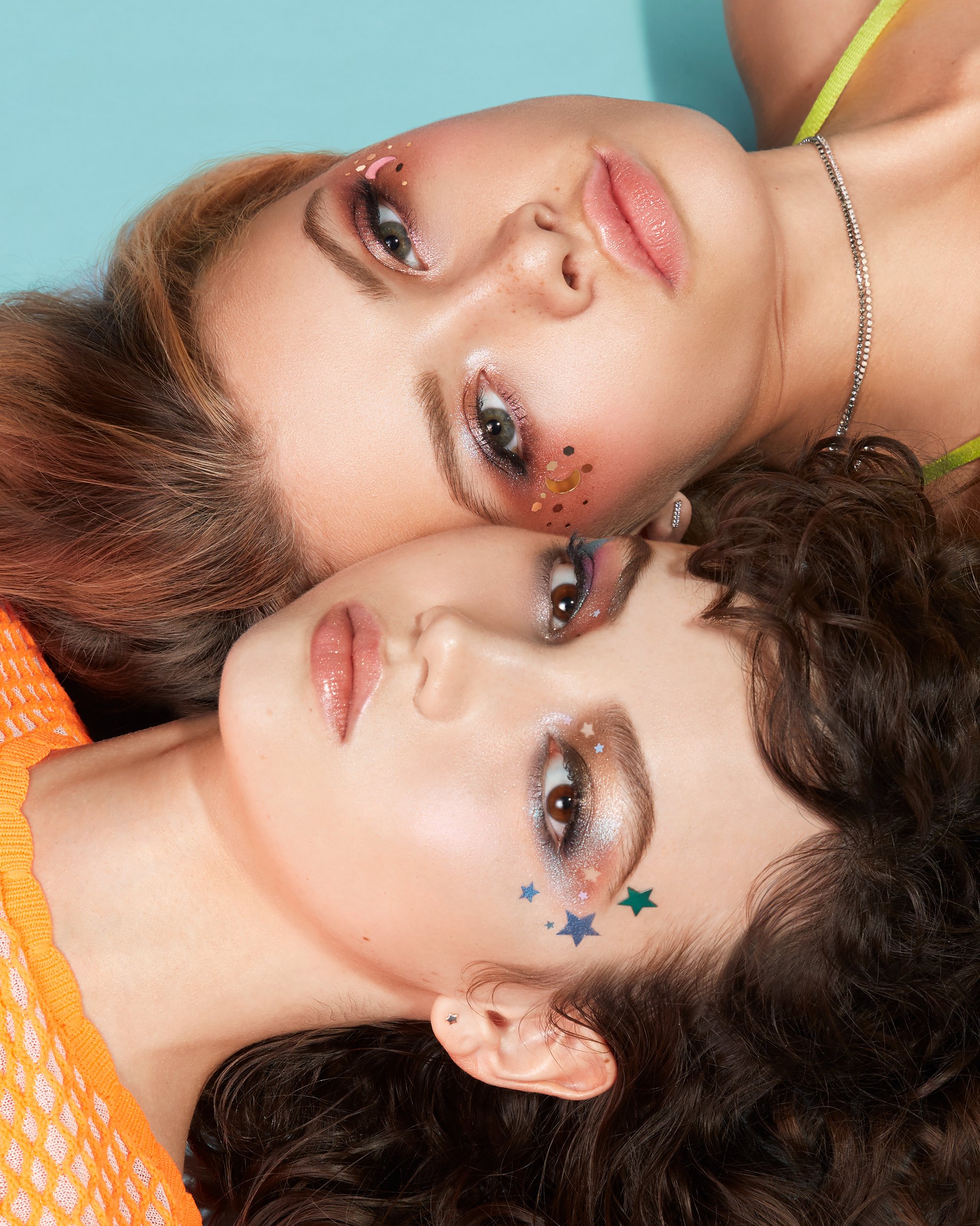
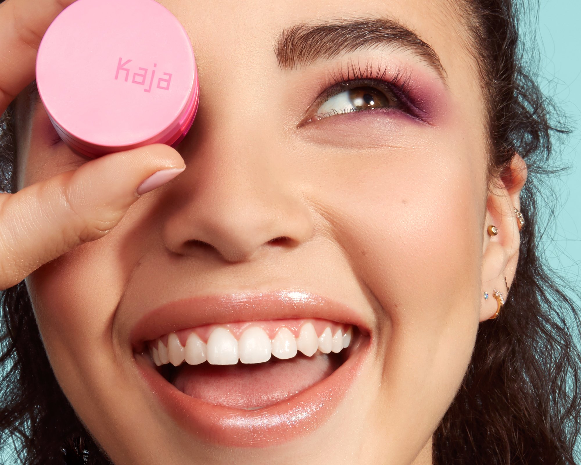
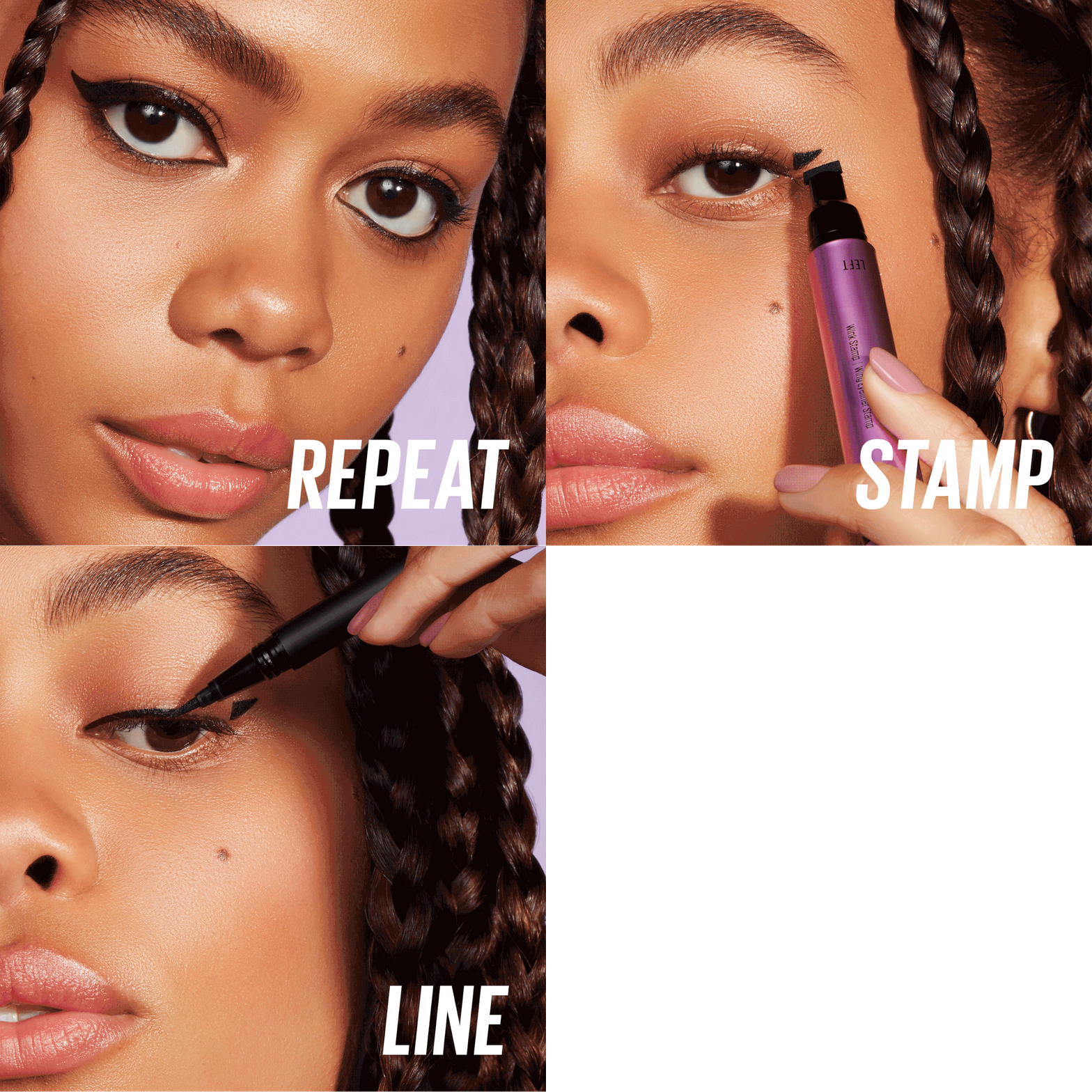
PHOTOGRAPHY
Conceptualized and produced photoshoots for seasonal campaigns and product launches between 2018-2020: including editorial and macro on-figure, stylized product, arm swatches, and smears.


